AI CoPilot Dashboard
Product Design - Internship Project
An intuitive AI-powered dashboard that simplifies workflows, offering real-time insights, smart suggestions, and action-ready tasks.
Industry
SaaS
Timeline
2 weeks
Company Name/ Client
Whatfix
Your Role
Intern
Overview
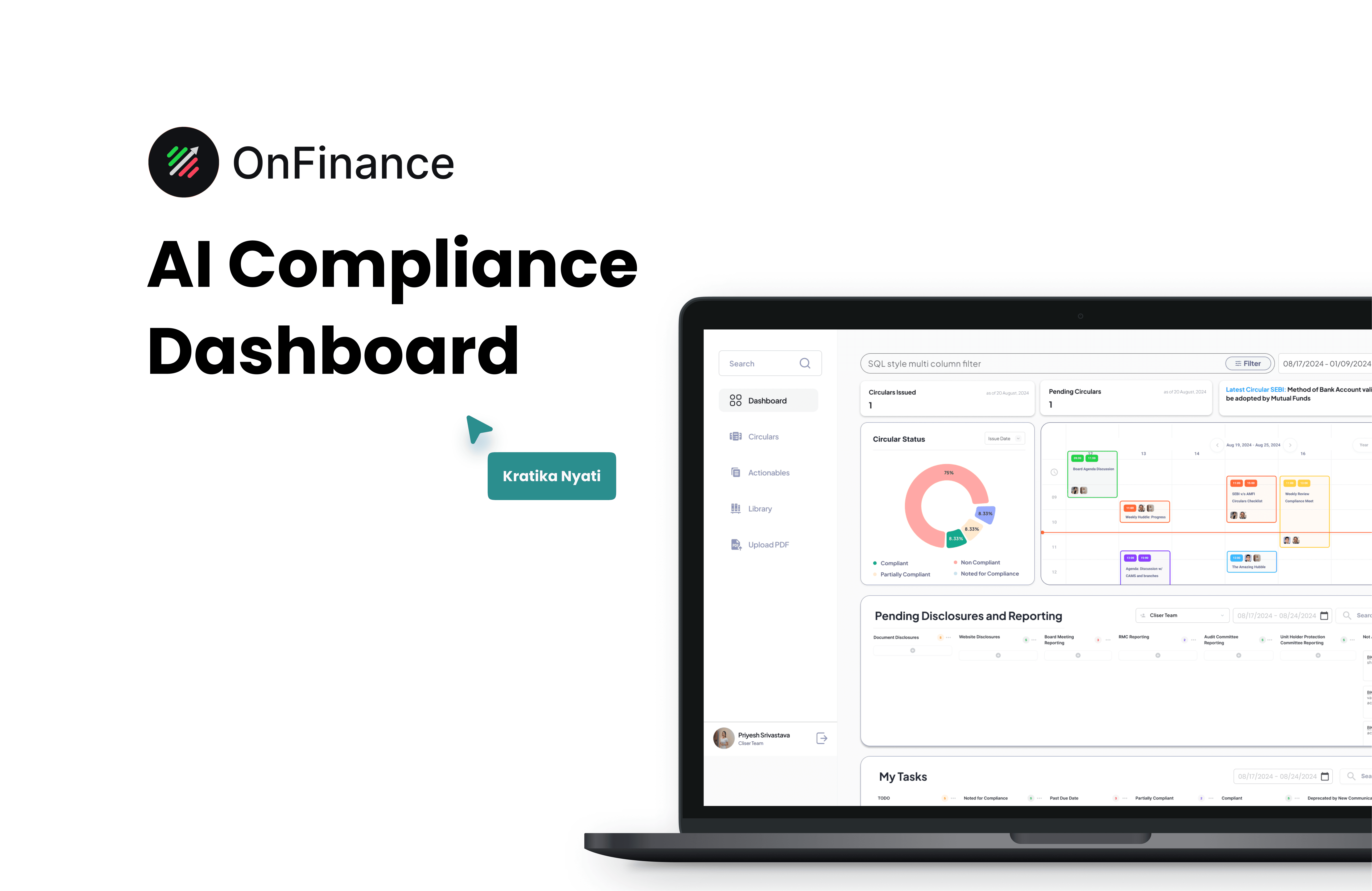
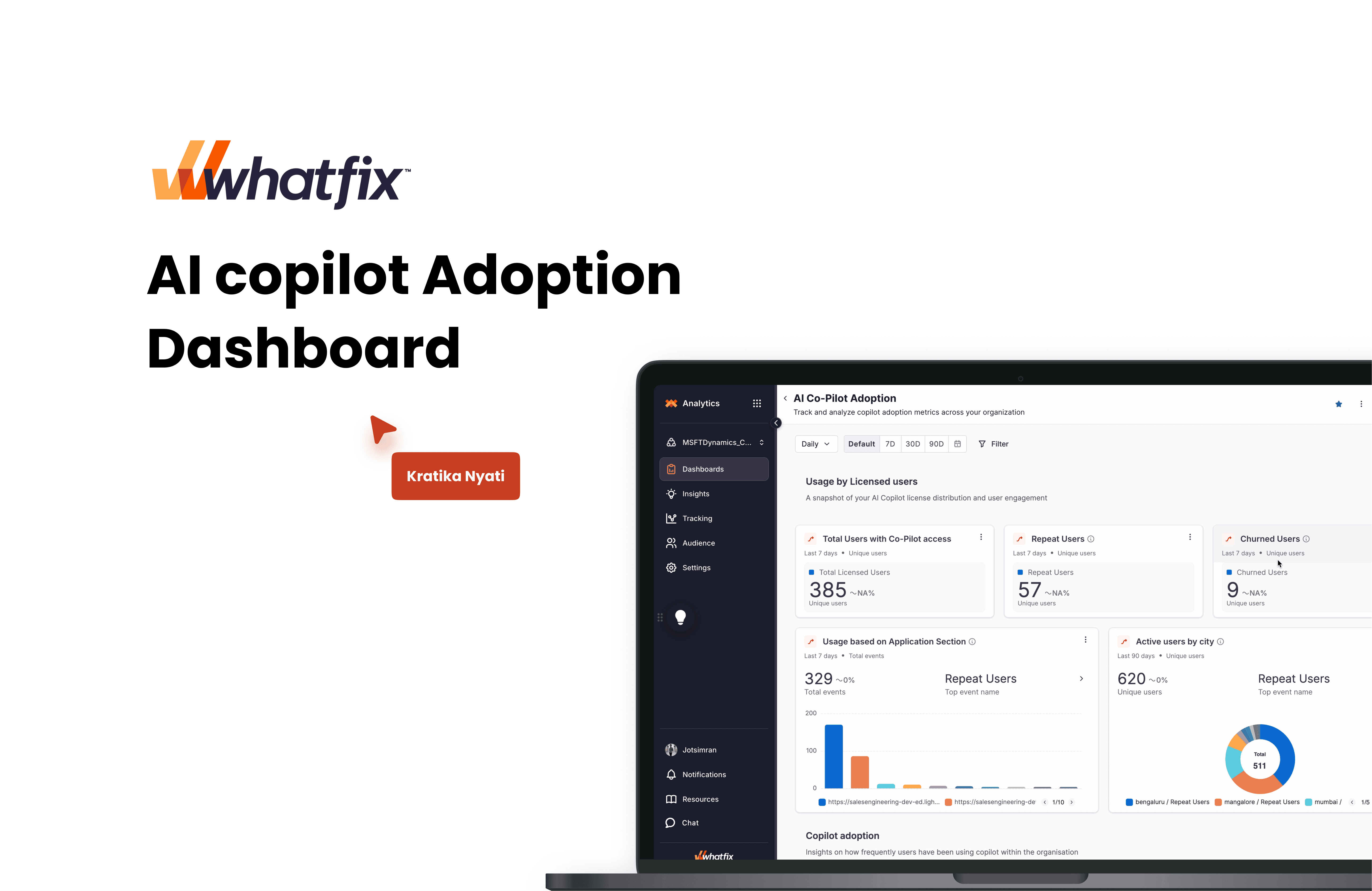
The AI Copilot Dashboard is a centralized, responsive workspace where users can interact with AI-driven suggestions, track actions, and visualize key data — all in one clean interface.
Role
Product Designer (UI/UX): Led the design system, dashboard layout, user flow optimization, and micro-interaction logic from concept to prototype.
Challenge
AI tools often overwhelm users with too much information or unclear prompts. The goal was to make AI interactions feel natural, purposeful, and user-first — not robotic or detached.
Solution
Designed a modular, intelligent dashboard that contextualizes AI suggestions within the user’s workflow. Prioritized usability, real-time feedback, and visual hierarchy to ensure clarity and control.
Outcome based on customer data collected
32%
faster task completion after integrating AI suggestions
65%
Reduction in cognitive load by simplifying multi-step processes
92%
Users found AI suggestions contextually relevant


What was the problem statement identified to solve?
Insight Accessibility: How might we empower users to quickly extract actionable insights from each dashboard chart?
Dashboard Usability: How might we improve the dashboard creation experience, providing users with greater control over widget management?
Cross-Device Compatibility: How might we ensure a consistent and optimized user experience across devices of varying sizes, including mobile and tablet?
How did we go about solving this?

1. Dashboard Creation and Customization
Flexible Grid System: Transitioned to a 12-column grid system to allow more flexible layouts.
Responsive Design: Defined minimum and maximum dashboard widths with corresponding breakpoints to ensure optimal display across devices.
2. Chart Widget Redesign
Adaptive Sizing: Implemented responsive chart sizes to maintain readability on different screen sizes.
Enhanced Hover States: Provided more detailed information on hover to aid data interpretation.
Reduced Redundancy: Eliminated repetitive event names in breakdowns to declutter the interface.


3. Windows Display Fixes
Scaling Adjustments: Optimized the dashboard for Windows' default 150% screen magnification to prevent oversized and illegible displays.